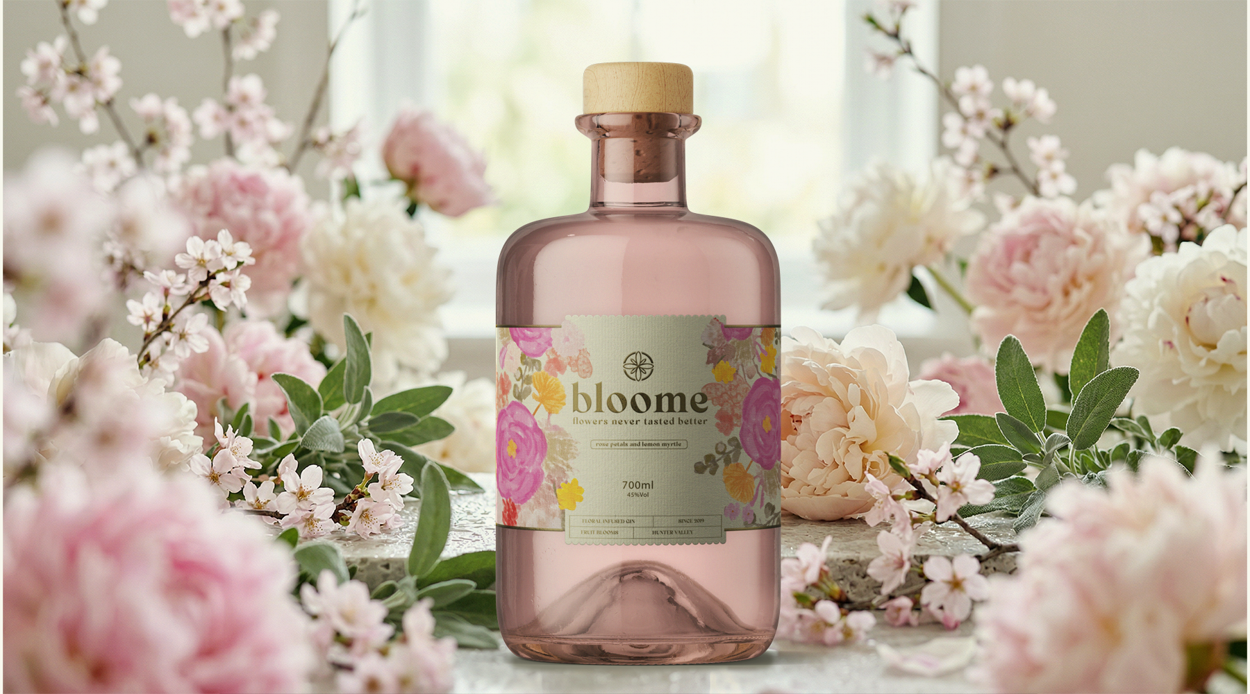
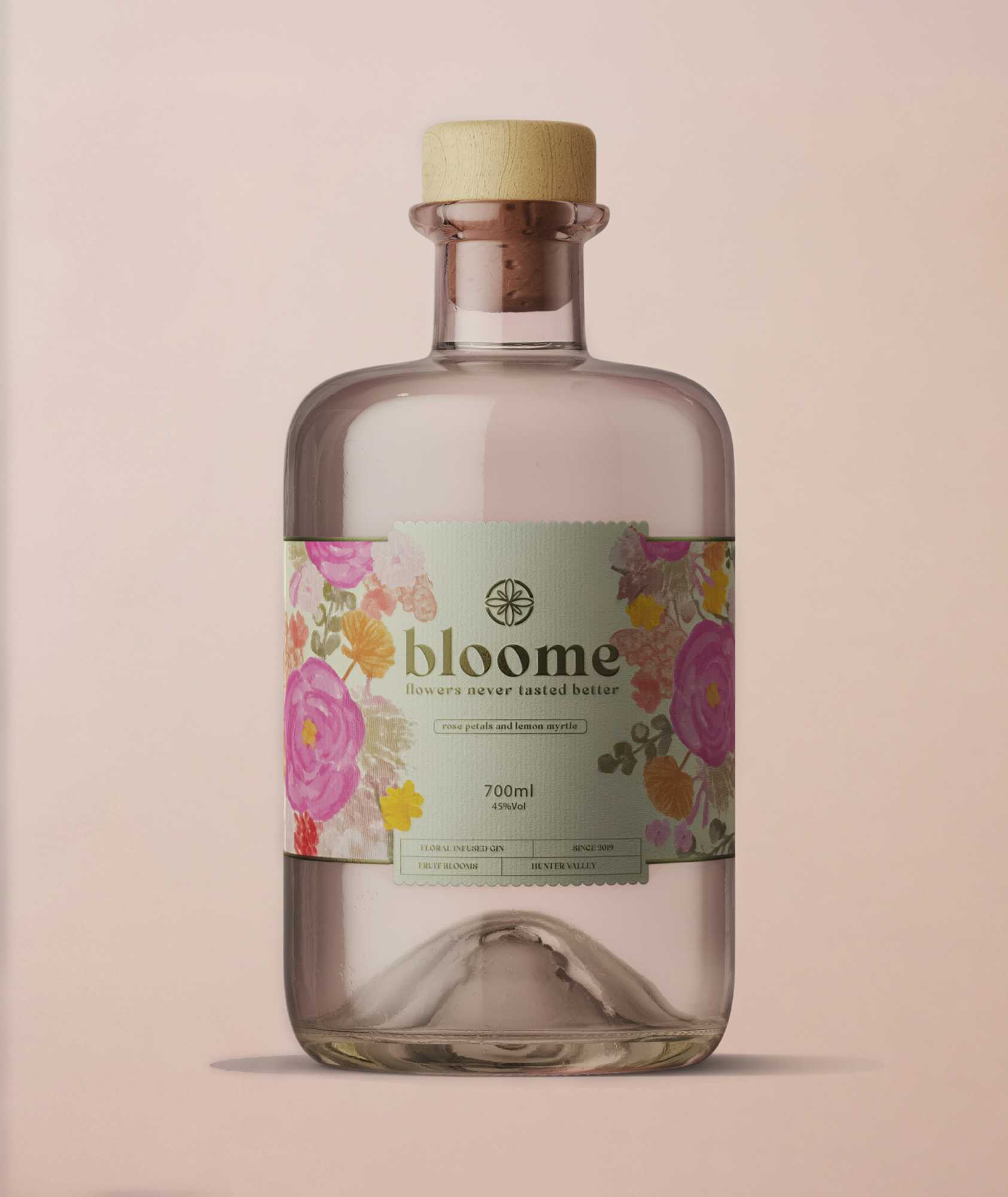
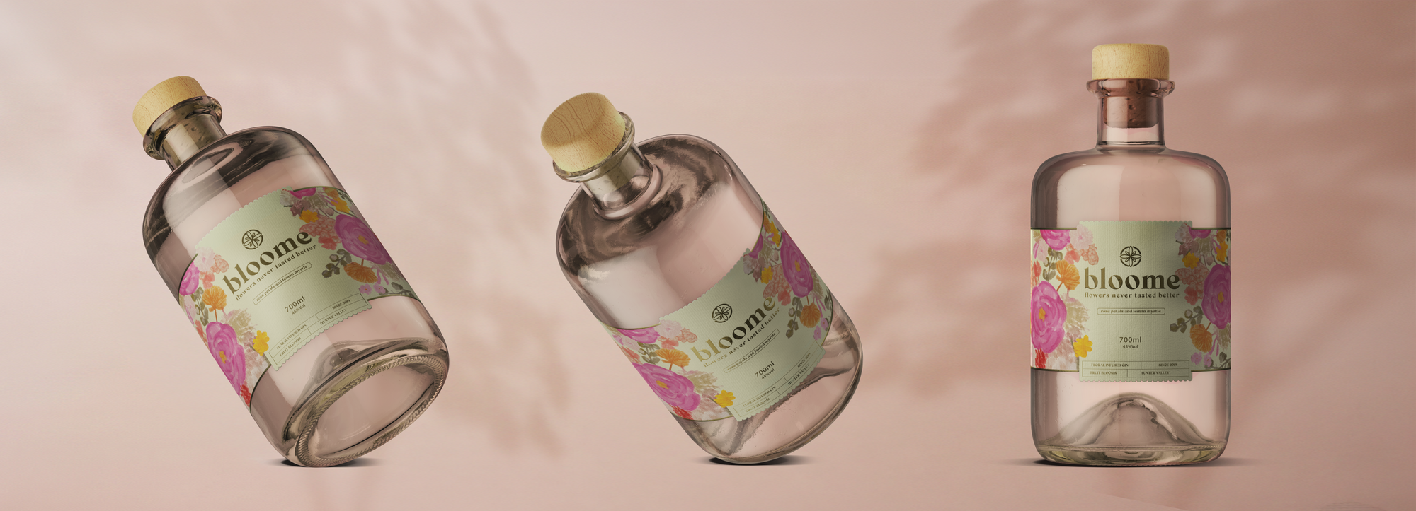
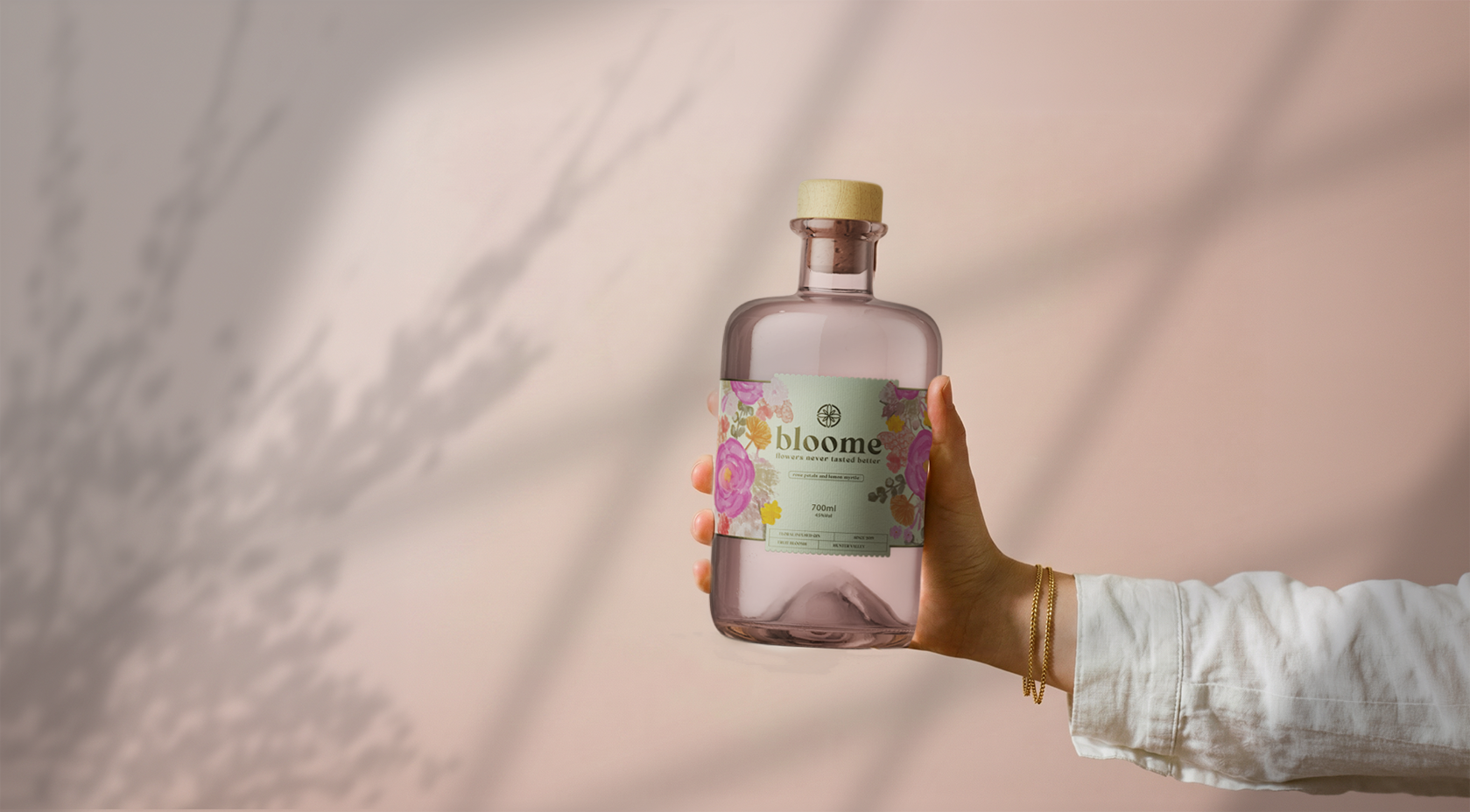
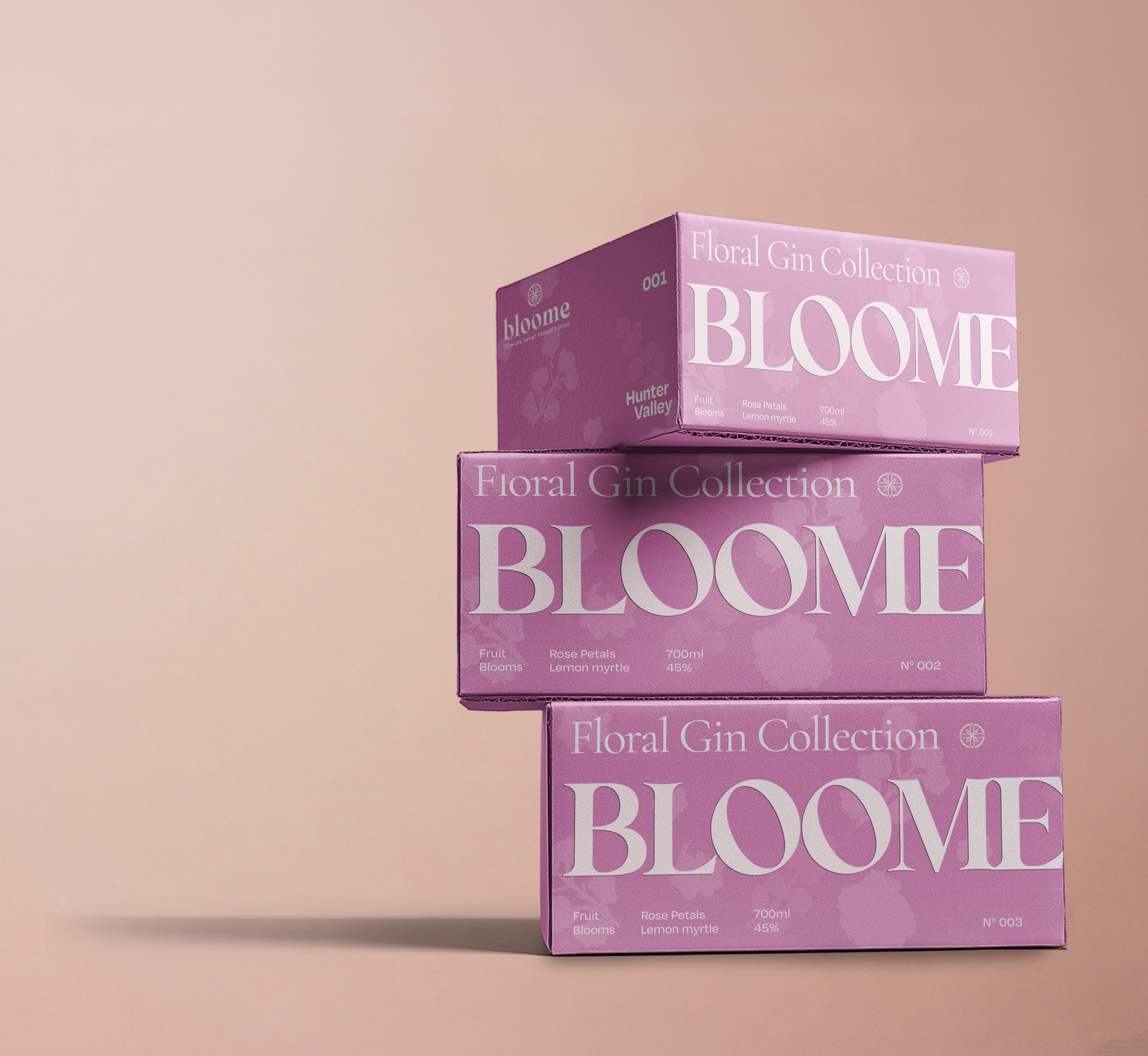
A floral gin needed packaging that felt as fresh as the flowers it's inspired by, without sliding into the generic “pretty botanical” look every other spirits brand already owns.
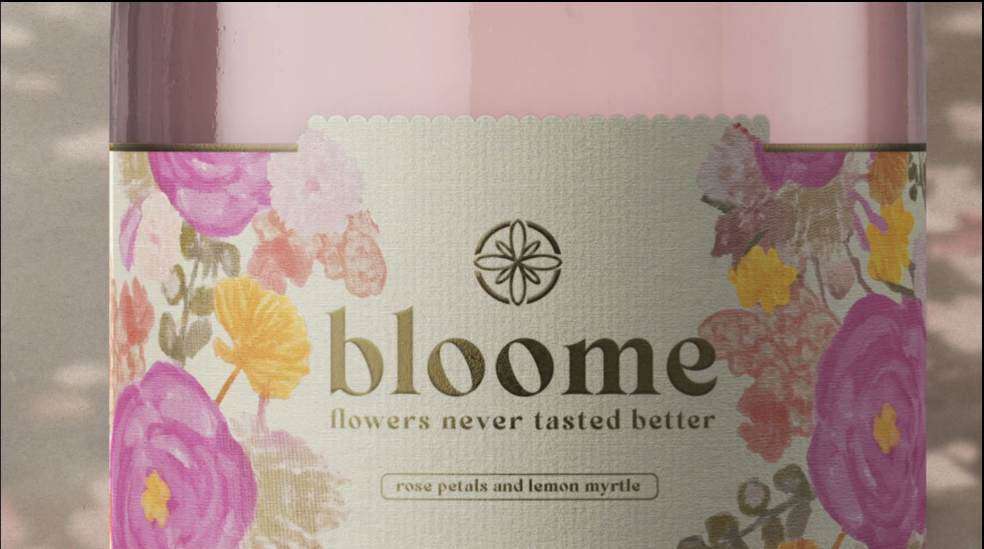
A hand-illustrated bouquet, rendered in watercolour to keep the feel small and family-made rather than mass-produced. The colour palette runs bright and saturated, doing double duty as flavour: vivid enough that you can almost taste the floral hit before the first sip.